Time off heatmap

What does it do?
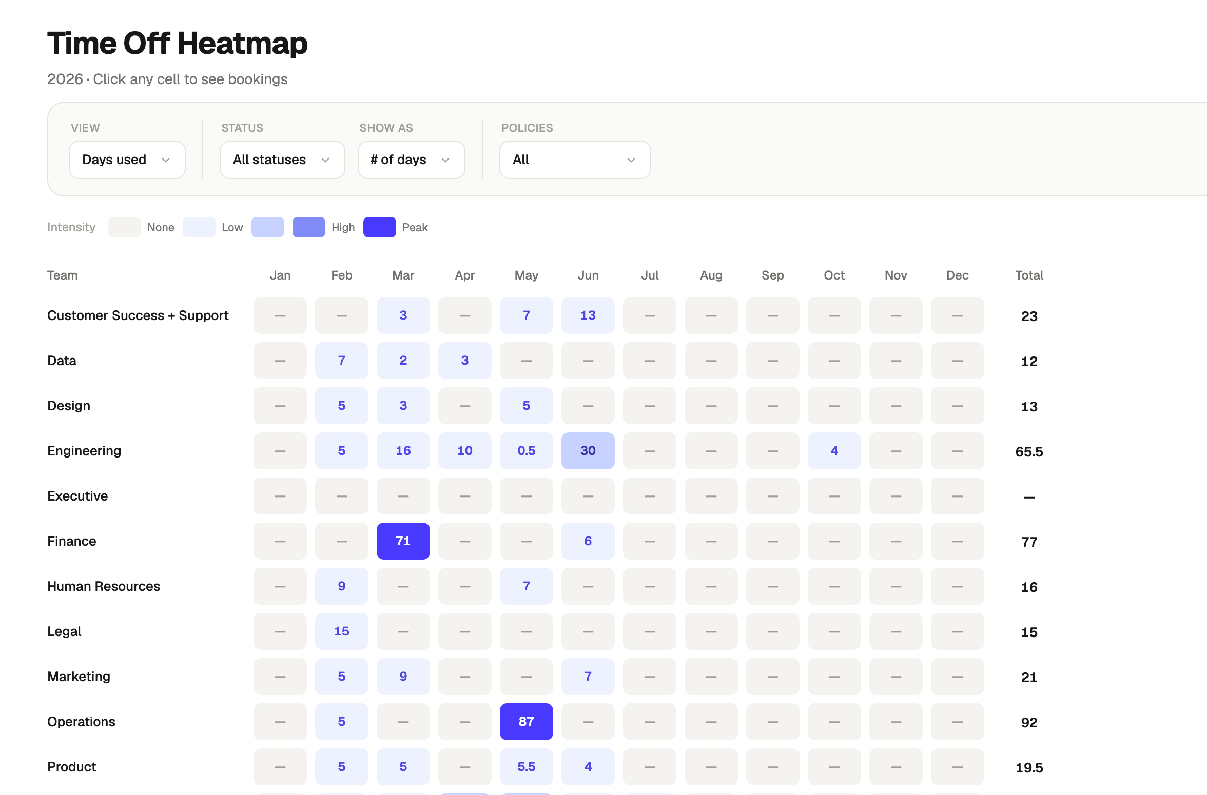
A heatmap view that visualises time off usage across every team, month by month, for the full year. Colour intensity shows where leave is concentrating, making it easy to spot peak periods, outlier months, and teams that are consistently over or under their available allowance. Toggles let you switch between days used and days available, absolute day counts and percentage of total, and filter down to specific leave policies or approved bookings only.
When should it be used?
When you need a pattern view of time off across the org rather than individual records. Most useful during headcount and capacity planning, ahead of busy periods when you need to understand historical leave clustering, or when reviewing whether time off is being taken consistently across teams. Also useful for spotting teams where leave is bottlenecking in specific months or barely being used at all.
What's inside?
- A full-year heatmap with one row per team and one column per month, colour-coded by intensity from none to peak.
- Toggles for days used versus days available, raw day count versus percentage of total, and approved only versus all bookings.
- A policy filter to scope the heatmap to one or more leave types.
- A colour intensity legend showing the none to peak scale.
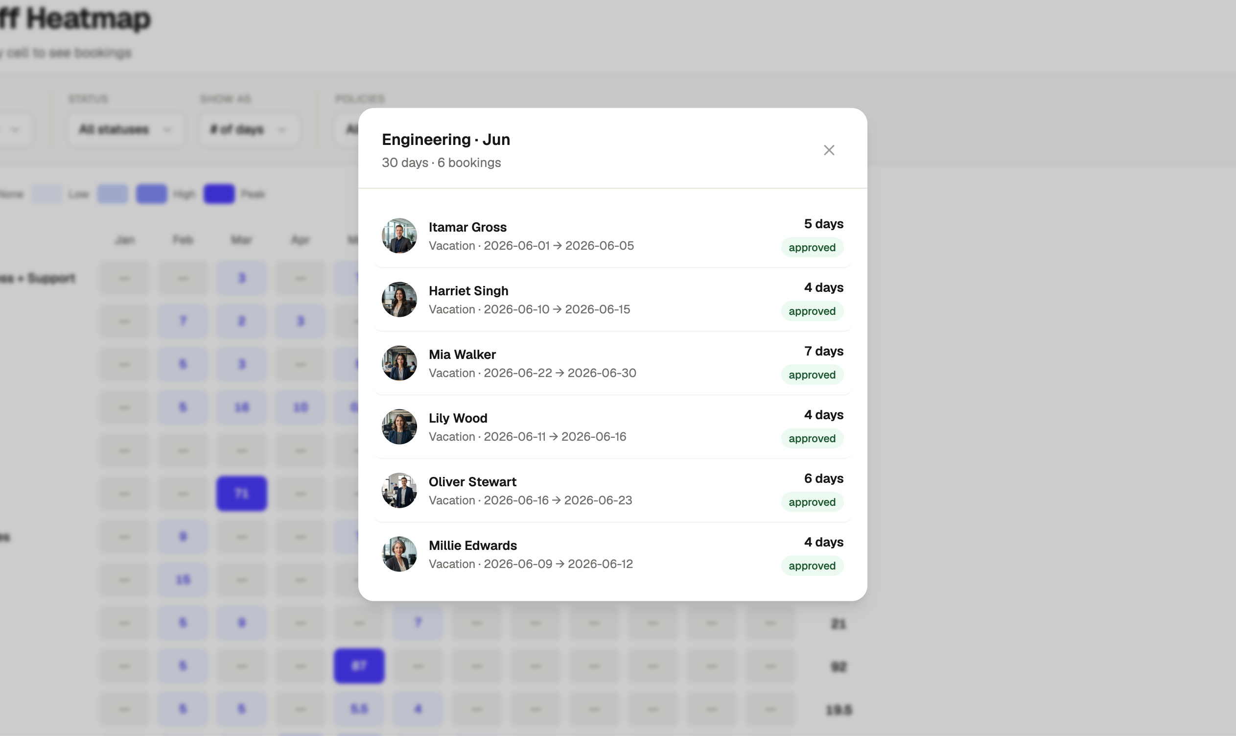
- Clickable cells that open the individual bookings behind that team and month.
- A banner flagging any employees without a team who are excluded from the heatmap, with a link to view the list.